INSID
For the renamed CSPSD to INSID, we created a new identity concept including a brand manual.
Other
Branding
Concept
INSID, formerly CSPSD, is the authority of the Ministry of Transport that controls and regulates road transport.

The Centre for Road Transport Services (CSPSD) has been renamed the Inspectorate of Road Transport (INSID) for several reasons. INSID will have greater powers than CSPSD, including the ability to stop vehicles, impose on-the-spot fines, remove documents and license plates, and prevent further driving. The new Inspectorate will be technically equipped and capable of carrying out more intensive vehicle inspections and inspecting Technical Inspection Stations (STK) and Emission Measurement Stations. The aim is to improve road safety and ensure that vehicles are in good roadworthy condition. This change should contribute to more effective and consistent monitoring of the technical condition of vehicles and compliance with road transport rules.
In order to ensure that the changes are not just "under the hood" and that the new corporate identity adequately reflects this, a competition was launched to create a new brand identity for INSID, in which we participated.
There was a need to ensure that the new visual identity was consistent with INSID's values and objectives, while at the same time differentiating itself from the old CSPSD identity. It is not easy to achieve effective communication of the change in visual identity to all stakeholders, including staff, the public and partners, so that the change is well received and understood. The next stage would then be to update all physical and digital materials such as logos, websites, documents, uniforms and vehicles, which is often logistically challenging, but at the current scale is primarily about creating a new logo and incorporating the ground rules (colours, fonts) into the design manual. What needs to be kept in mind during the design process is maintaining the credibility and authority of the organisation during the transition, so as not to undermine public perception. Finally, ensuring that any changes are compliant and that no copyrights or trademarks are infringed is at least a given for us, but it is always something to keep an eye on.
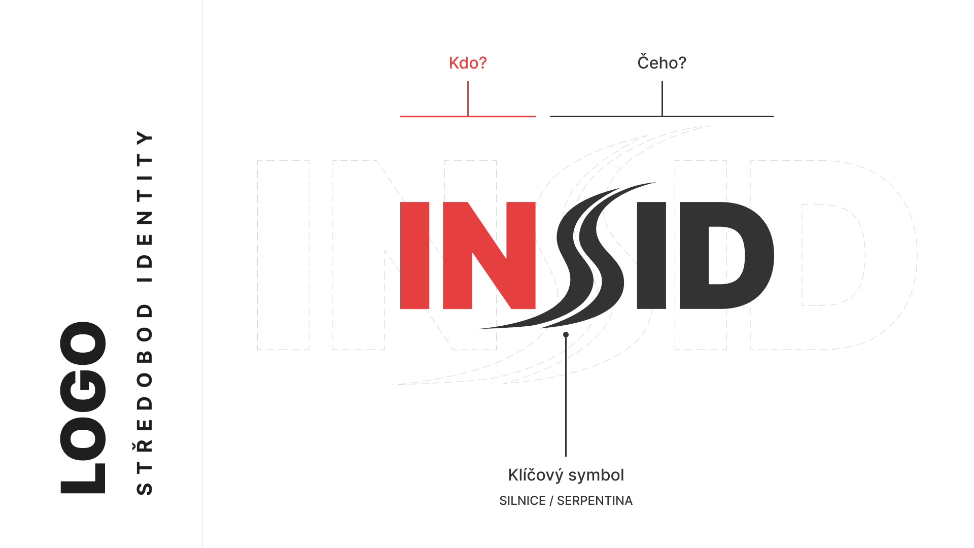
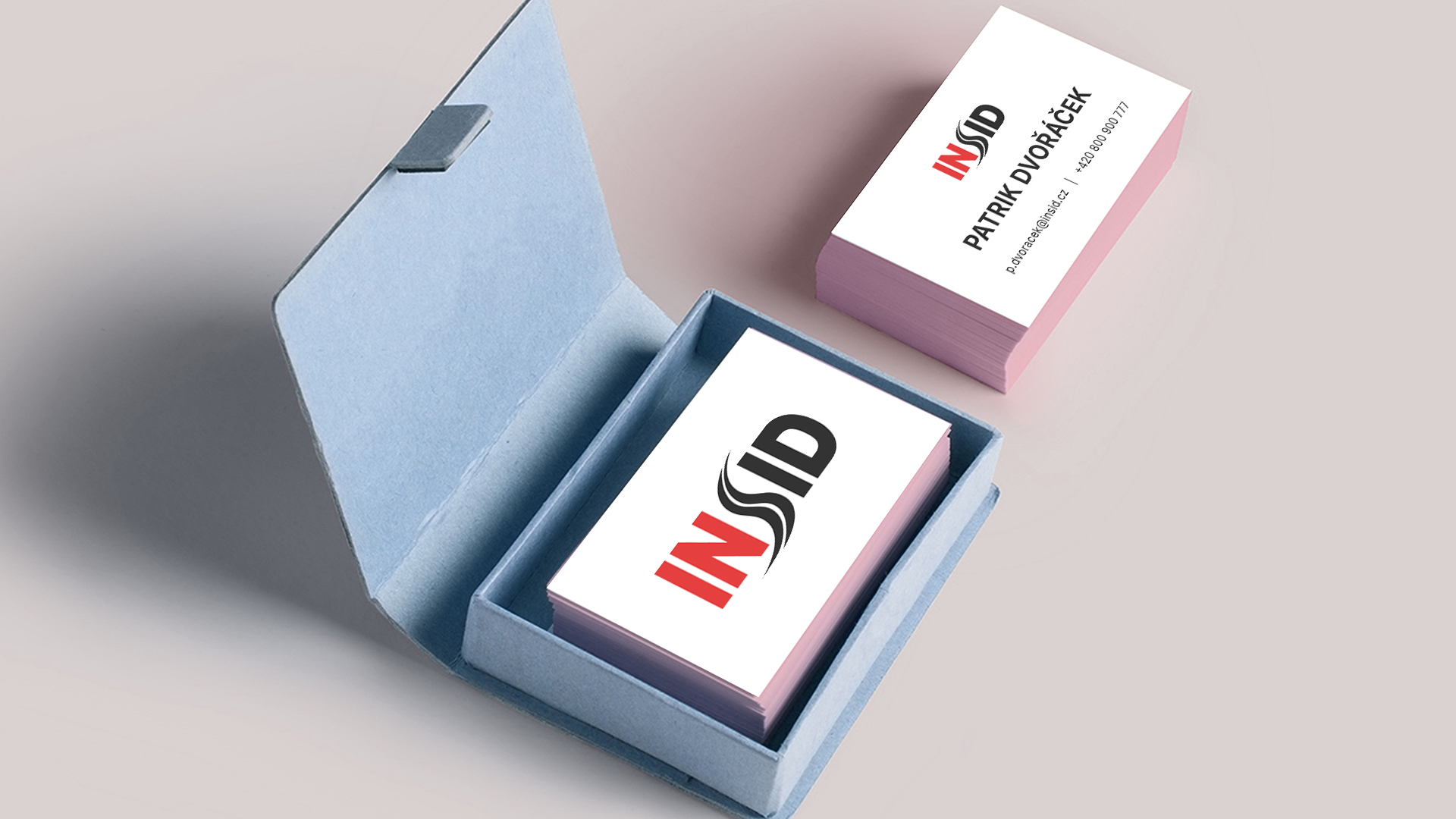
At the heart of the contract was the creation of the logo. We aimed to reflect the symbolism of the roads in the logo, for which we proposed the letter S in the abbreviation INSID. The initial of the word "road" is thus visually replaced by a serpentine road. The basic version of the logo separates the word 'Inspection' from 'road transport' in colour.
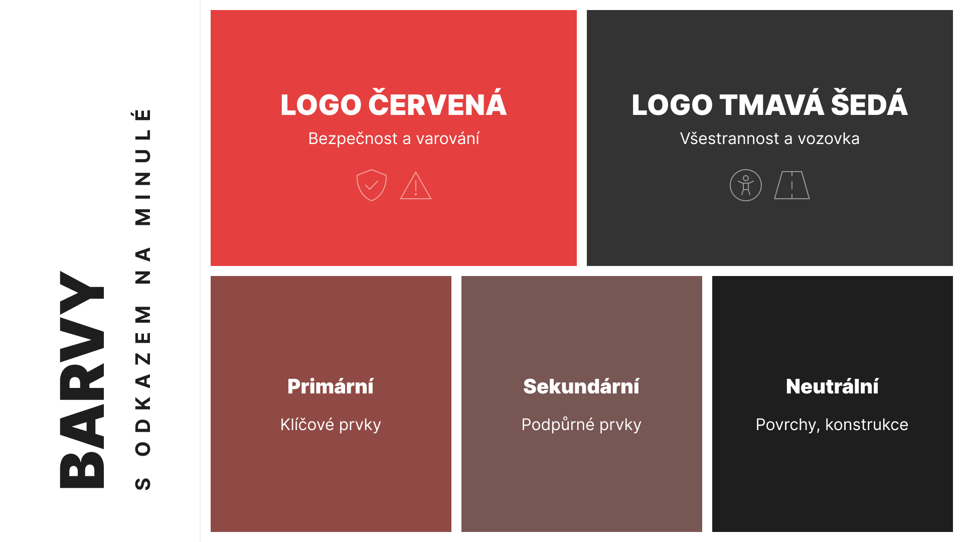
The colour tone of red and dark grey honours the history of the brand and thus subtly continues and modernises the concept together with the shape. In this respect, the red evokes feelings of warning and safety, while the dark grey evokes versatility and roadworthiness. From these key colours, we then derived colour schemes with descriptions of the features, in both light and dark themes.
Our proposal successfully made it to the final three of the best candidates, which in itself is a huge success, as there were dozens of competing proposals. Unfortunately it didn't make it to the podium, but the energy and enthusiasm our design conveyed to the jury was great to see. It's great feedback on the quality our team is striving to achieve and the real impact this work can have. We'll just hope that on occasions like this, fortune smiles towards us and we can see the thing through to the end.


There has been enough scrolling, now it is time to get in touch and make sure we are the right fit for your project!
Go to contact2018 - #year © TwoDo s.r.o., all rights reserved. The website is powered by our own TwoDo CMS.