Reason
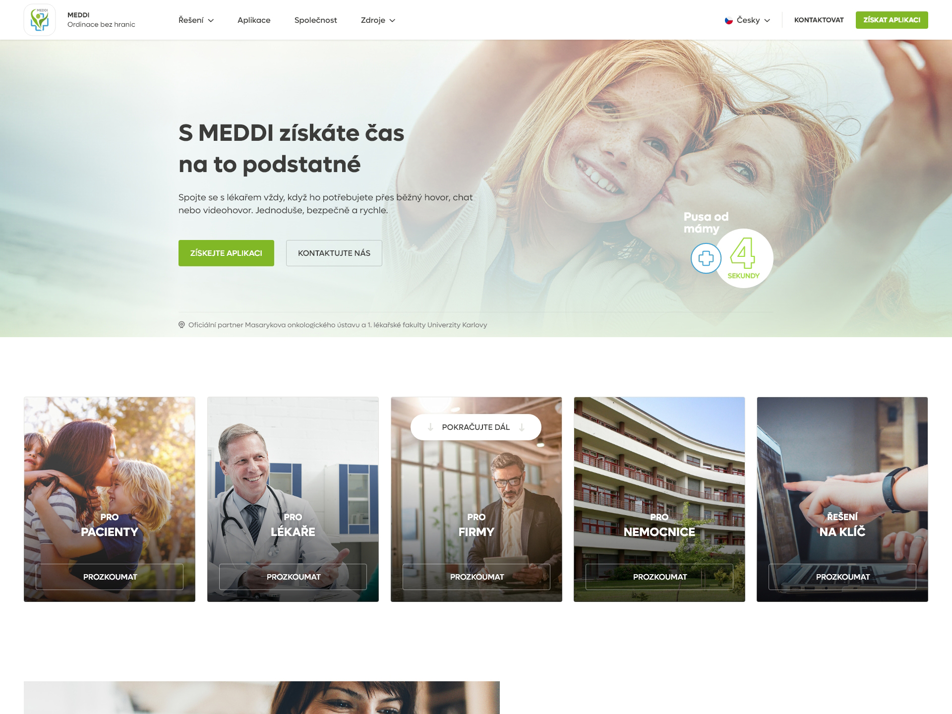
MEDDI was undergoing an expansion, working on a major campaign to get its ready-made product into the mainstream. The website, not excluding the website, had to go through a transformation that would adequately reflect the direction of the product. And so, in partnership with KNKTR, we came on the scene to take care of the web design.

Challenge
The biggest challenge, as is often the case, was to do a thorough preparation and description of the target groups so that we knew how to target the content to them. At the same time, this was not a small-scale site, and so we needed to come up with a large number of consistent components and other elements that would make up the web design.
Solution
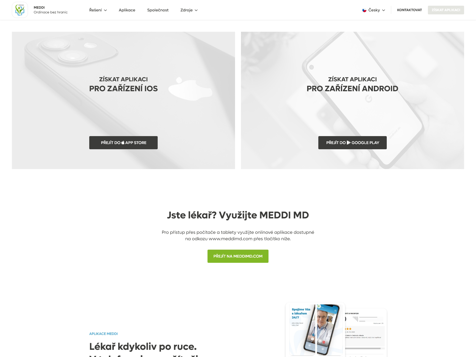
This resulted in a design that effectively guides the visitor from the homepage to the right places according to the target group. There, he or she learns further details and is ideally directed further towards conversion. Emphasis was placed on working with photos, slogans, saving everyone's time, which can be put to better use than in a waiting room. Web design was delivered in all responsive views from desktop to mobile.
Result
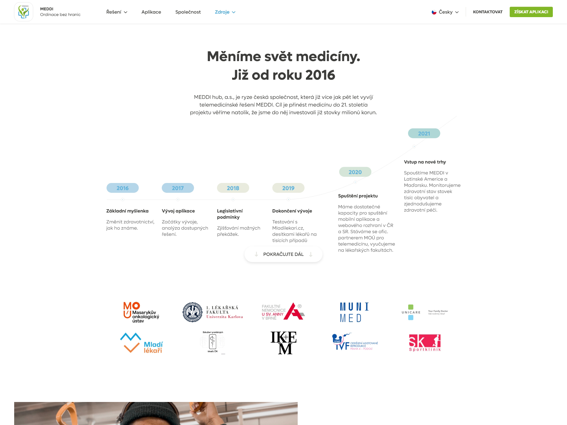
Although there were many obstacles during the work, we overcame everything, successfully completed the design and handed it over to the client. Because MEDDI had in-house development capability, we handed the documents over to another team for development, who did some final tweaking as the design prototype was being turned into the final website. Thanks again to our partner KNKTR for the opportunity to be there for such great projects!
They trust us


Now just drop us a line
There has been enough scrolling, now it is time to get in touch and make sure we are the right fit for your project!
Go to contact2018 - #year © TwoDo s.r.o., all rights reserved. The website is powered by our own TwoDo CMS.