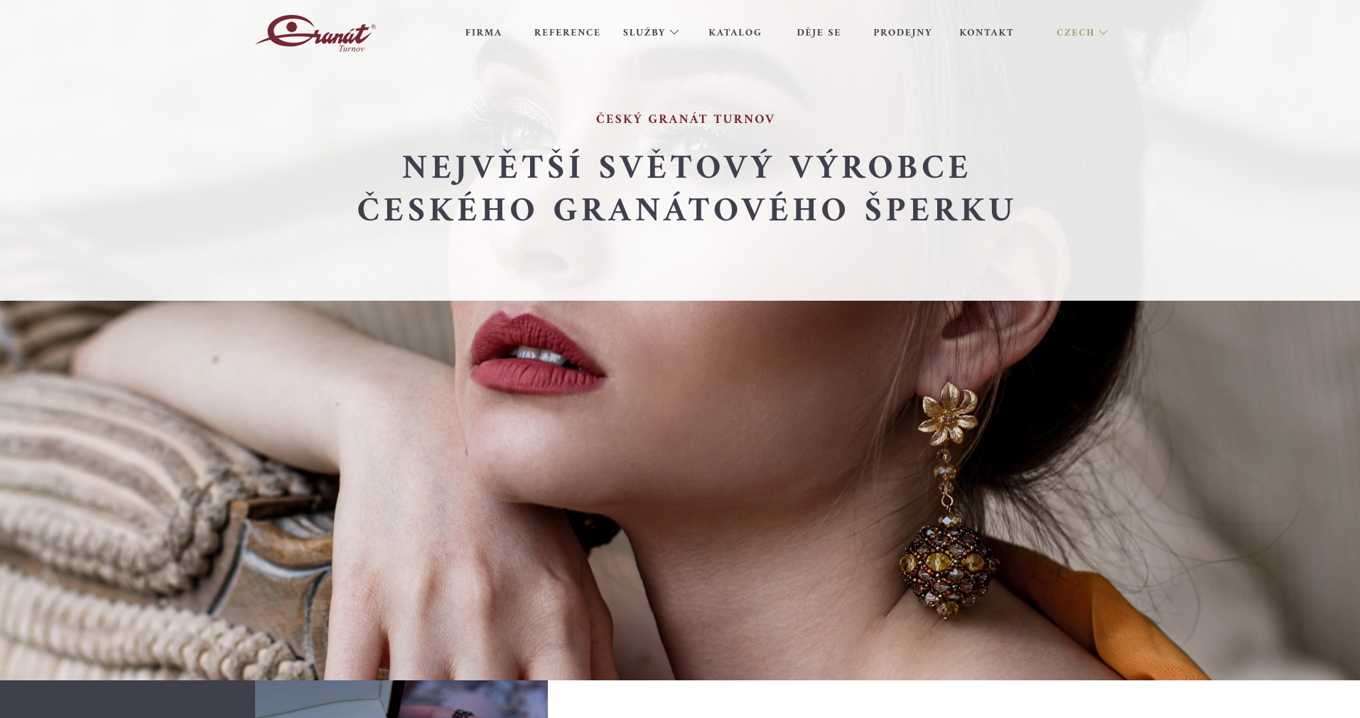
Český granát Turnov

Traditional Czech jewellery manufacturer with worldwide sales, supplying jewellery for important events and personalities.
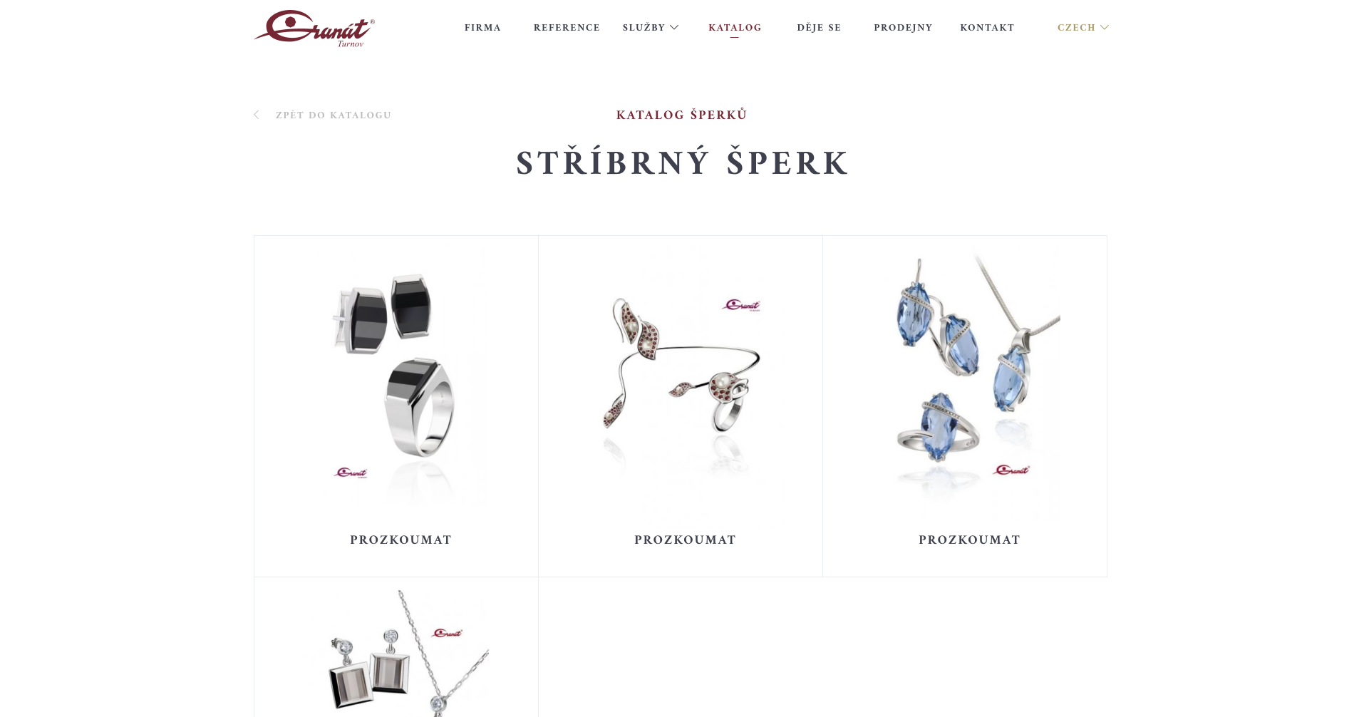
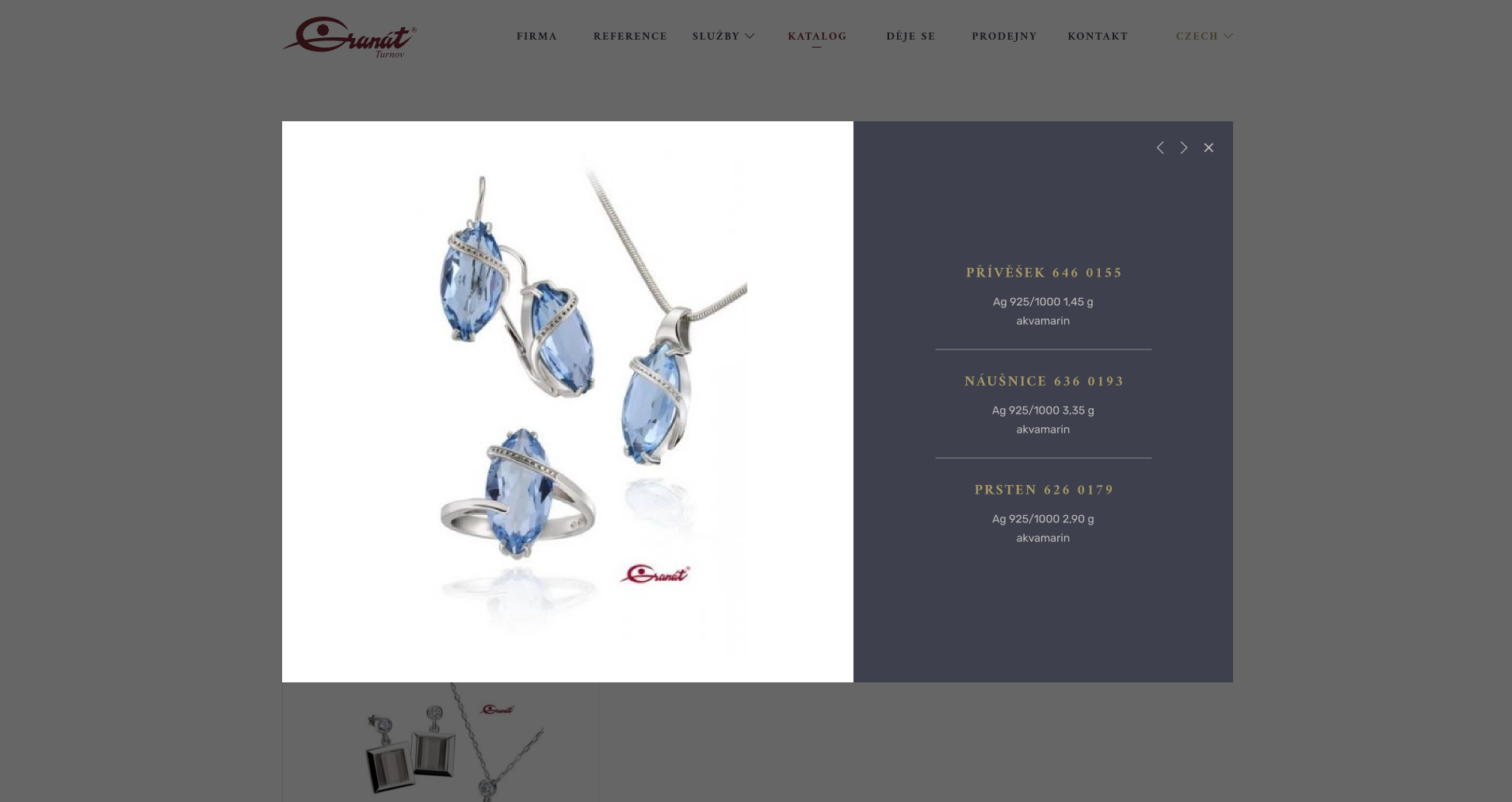
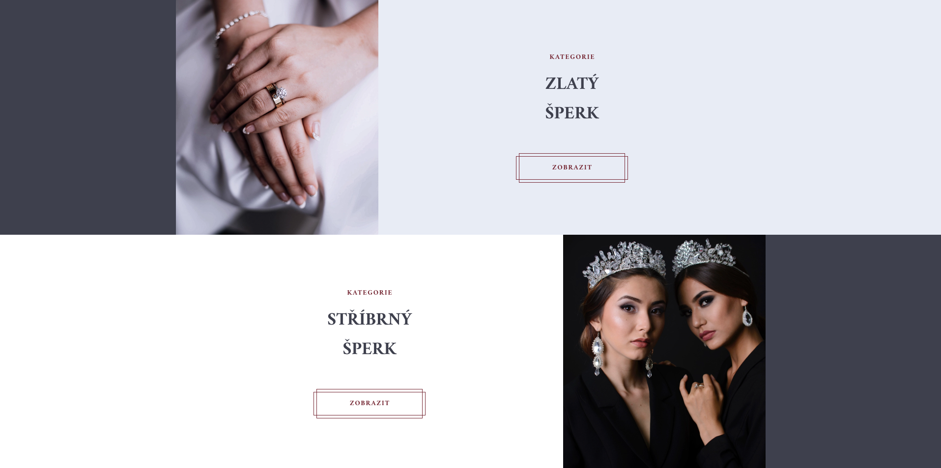
Web
Designing
Concept
We successfully took the website out of the old rut and gave it a luxurious and elegant look worthy of the jewellery shop's business plan.
Client accepted in 2020
a person with red lipstick and earrings
stripe

Reason

Granát Turnov had been looking for some time for someone who understood the tradition and precision they put into their jewellery and was able to design a website worthy of their name. The original website was unresponsive and full of outdated elements. We were given a completely free hand in how the new site should look. The requirements were, of course, to take the original content, add emphasis on the history and achievements of the brand, bring the look closer to the biggest players in the market and better represent other Granat essentials such as B2C and B2B eshop, collections or events around the brand.

a person with red lipstick and earrings
stripe

Challenge

To get a good grasp of the theme, we had to conduct a rigorous market research on how the global brands in the industry are doing, what identity to stamp in order to resonate with the target customer in the perception of tradition, quality, prestige and affordability. It was also necessary to go through the existing website in detail, get a good grasp of the structure and simplify it in terms of redundant information so that browsing did not become confusing. There was also a need to obtain good quality photographic documentation of products, manufacturing processes and other images to achieve the desired look and feel.

a screenshot of a website
stripe

Solution

The design of the site is based on the graceful colours of garnet red, gold and grey-blue to silver shades. To promote luxury, a footer font Amiri was chosen for the headings and a heelless Rubik for the regular text for faster readability. Buttons and icons were aligned in outline style, which in turn adds lightness and precision and works well with dividing lines.

The overall flow of content must have been unremarkable. This creates a play of full blocks, photos and short clear messages on the screen in a regular wrap-around arrangement. This approach allowed us to have a fun layout that doesn't get cluttered and keeps the site visitor attentive. The different parts of the site are arranged in a clear horizontal menu and supported by the main page, which in this plays the role of a kind of signpost of possibilities.

a screenshot of a website
stripe

Result

The new design is thus a jewel in itself, inspiring customer confidence in the product that Granát Turnov creates. It clearly presents all aspects of the cooperative and together with the new designed brand facilitates the communication of the brand about its prestige and quality. The creation of such a work is a great humility for us and an opportunity to promote the added value from the workshop of our Czech country.

The graphic design of the website was not only aimed to reach a local market but a global one, which was supported by a familiar look and feel combined with language mutations, successfully reaching a wide range of target customers from different cultures.

a collage of women wearing jewelry
Contact us

Now just drop us a line

There has been enough scrolling, now it is time to get in touch and make sure we are the right fit for your project!