Reason
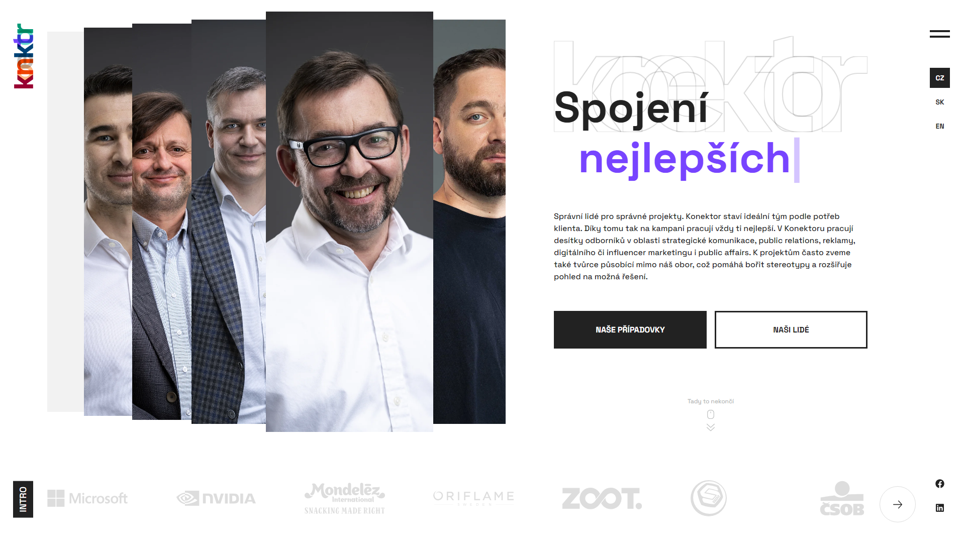
Thanks to their successes, Konektor has gradually grown, separate specialised divisions have been created and now the time has come for a major merger under one brand. This unification aims to bring a unified communication towards visitors, which allowed us to embark on the creation of a new design and subsequent development.

Challenge
Unifying the brand has definitely become a major challenge for our designers, however with Konektor the whole communication is always handled with bravado. The tricky part was also in the technical execution itself, as KNKTR is one of the first customers to get our custom editorial system, which multiplies the value of the entire piece.
Solution
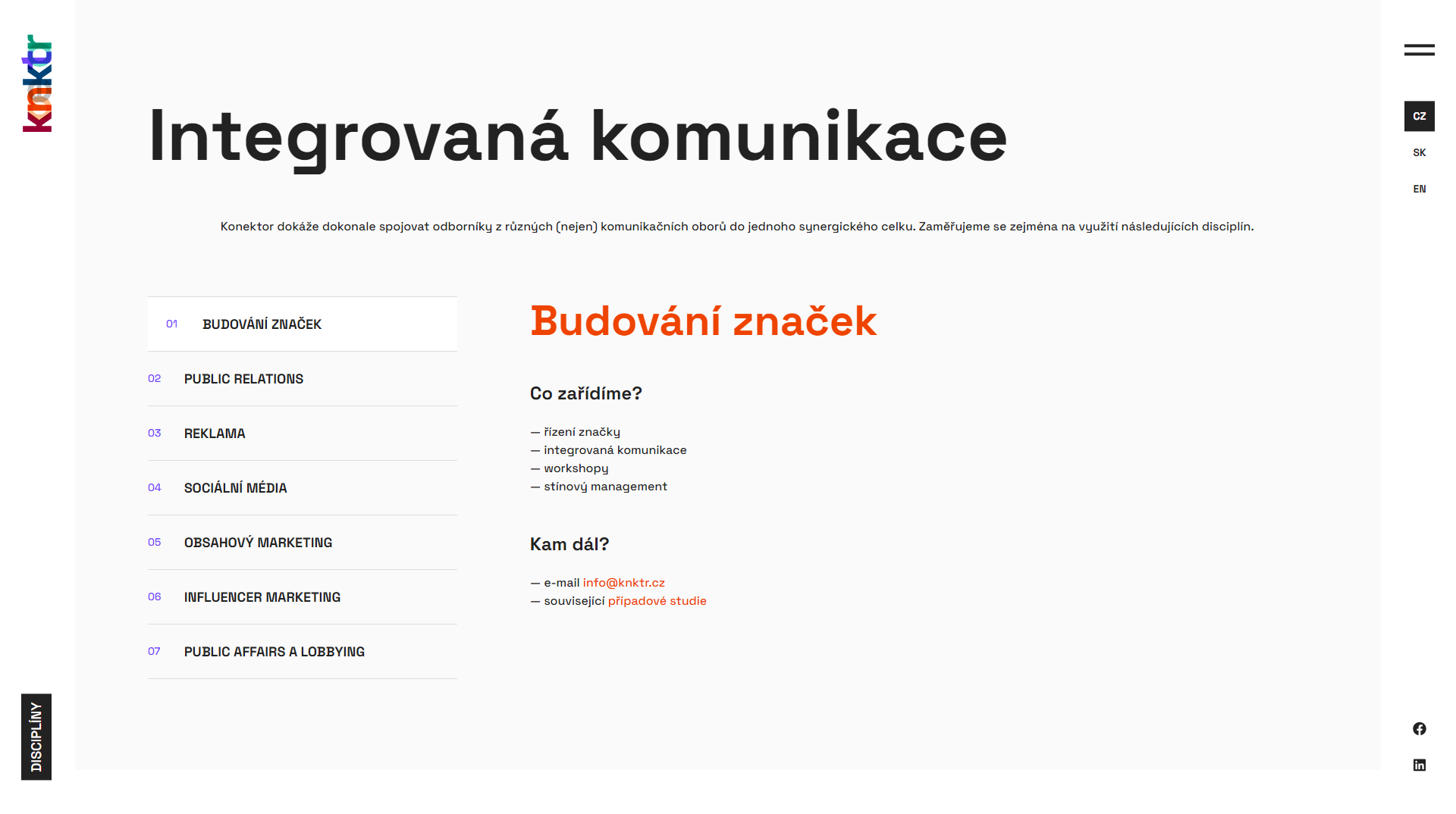
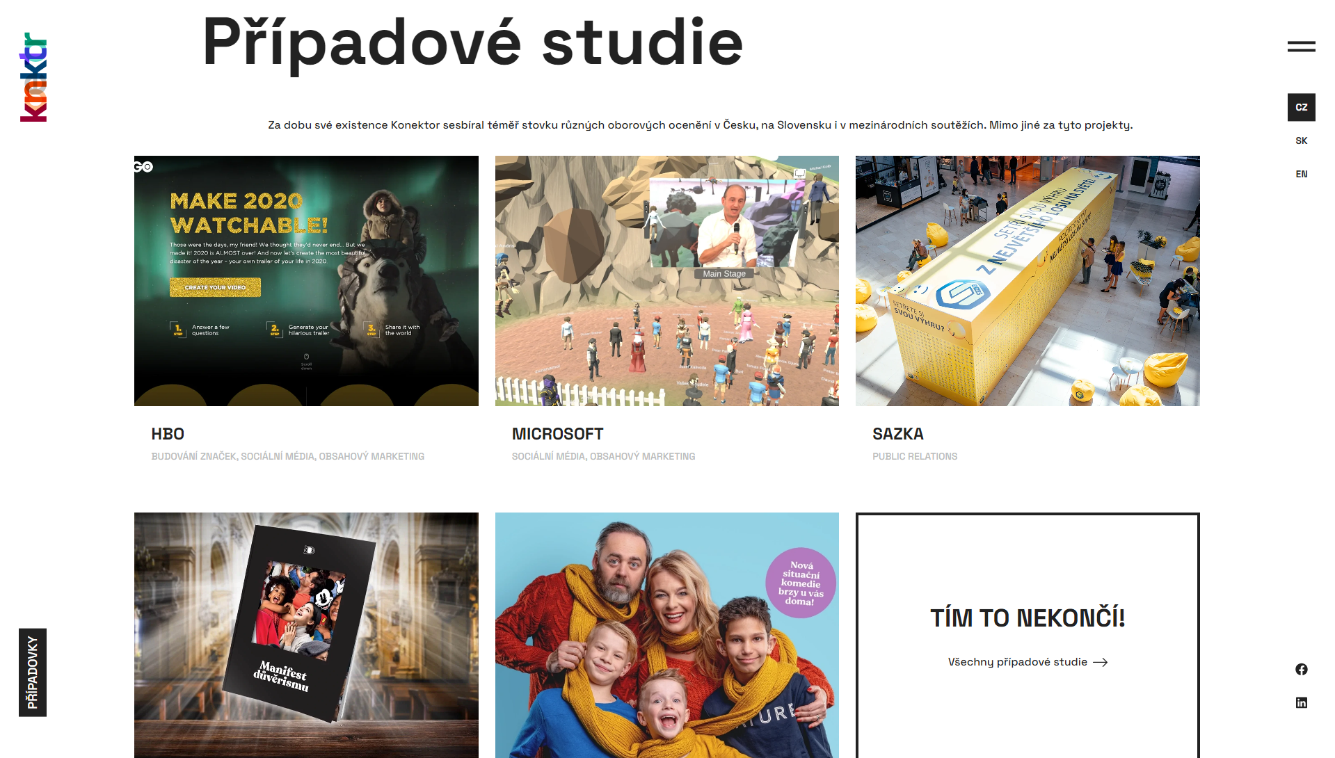
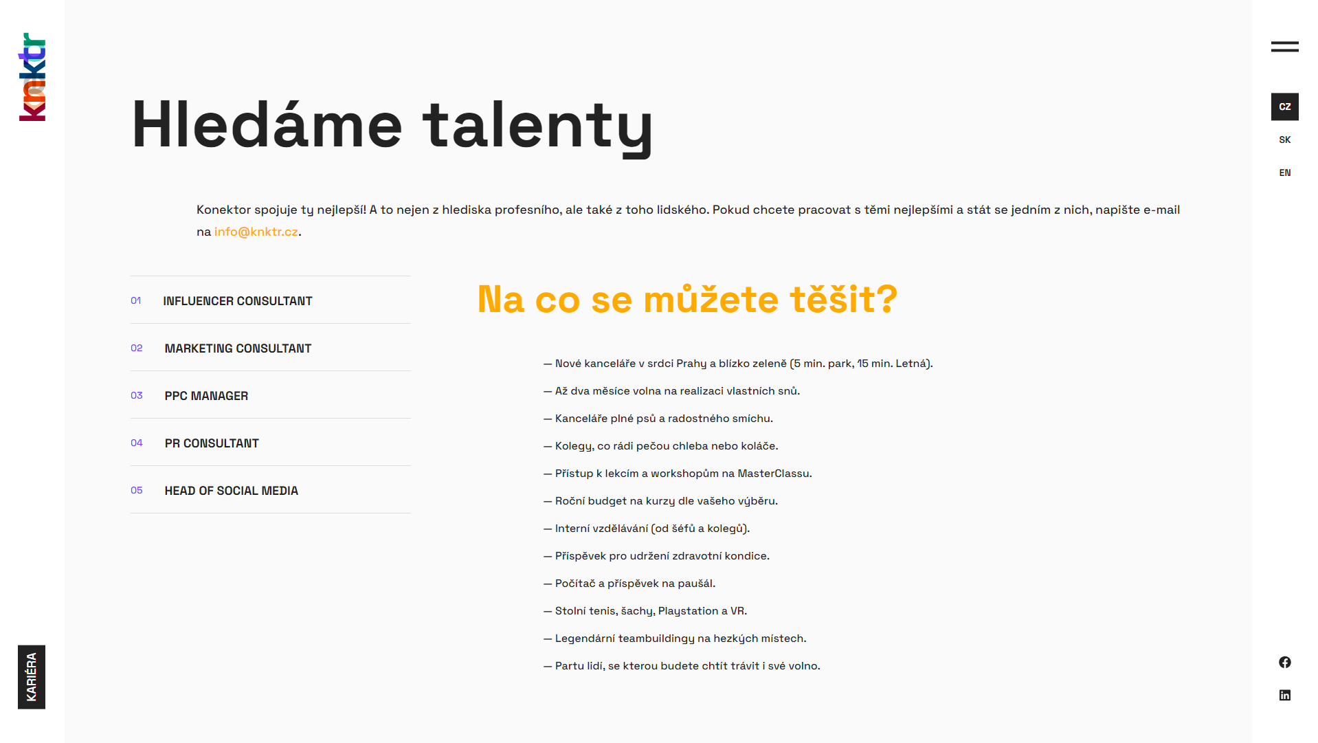
The visitor to the Konektor site will definitely not be overwhelmed with content. All brand merging is simplified in an exemplary way. We've helped the small page count with a number of graphical elements such as popups and slideshows. The communication is very concise, succinct and most importantly - clear. The clean, professional design is intertwined with the introduction of the team from the very beginning of the site. Overall, this raises the credibility in these top professionals and the visitor can get a nice idea of who they are going to be working with.
Result
We already have a history with Konektor and so we have been on the same page since the very beginning of the development. Thanks to ongoing consultations, the design proposals matched the ideas of the management and we could focus on the development of components using our new Aion content management system, which allows the customer to manage the entire site themselves.
They trust us


Now just drop us a line
There has been enough scrolling, now it is time to get in touch and make sure we are the right fit for your project!
Go to contact2018 - #year © TwoDo s.r.o., all rights reserved. The website is powered by our own TwoDo CMS.