Reason
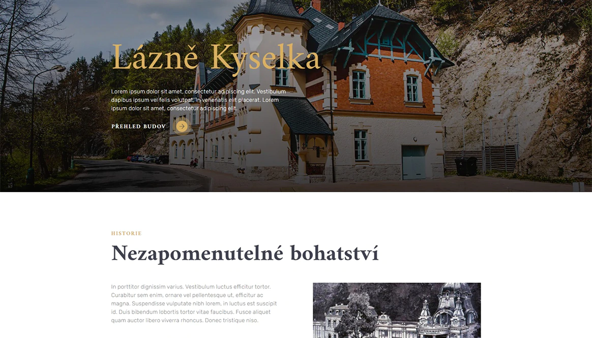
The main reason for creating the new digital business card was to add the necessary quality and grandeur that the spa with its history deserves. While there was a previous website, it was past its prime. At the very least, we used the necessary basic structure from it to build an entirely new piece of work.
The spa's managers have taken a loving approach to the maintenance and renovation of the entire site. They document all their work thoroughly, which has allowed us to make ample use of photographs of the authenticity of the site. The site serves not only to familiarize visitors with the site and individual buildings, but also to clearly communicate all the work done and the handling of budgets over the years.

Challenge
The client left all the implementation to us, and we felt a great responsibility to give design direction to such an important Czech cultural and natural asset. The challenge was to combine a touch of history into a modern design.
We are delighted at the trust placed in us from all the diverse disciplines and that we are able to meet new challenges all the time. Across the board, however, we are united by a single goal, and that is to bring the ultimate enjoyment to our users.
Solution
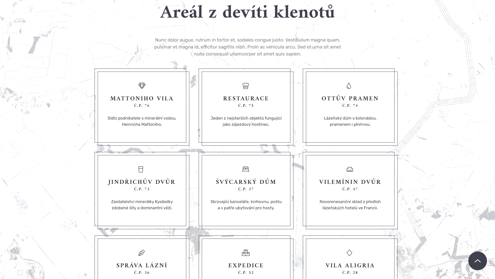
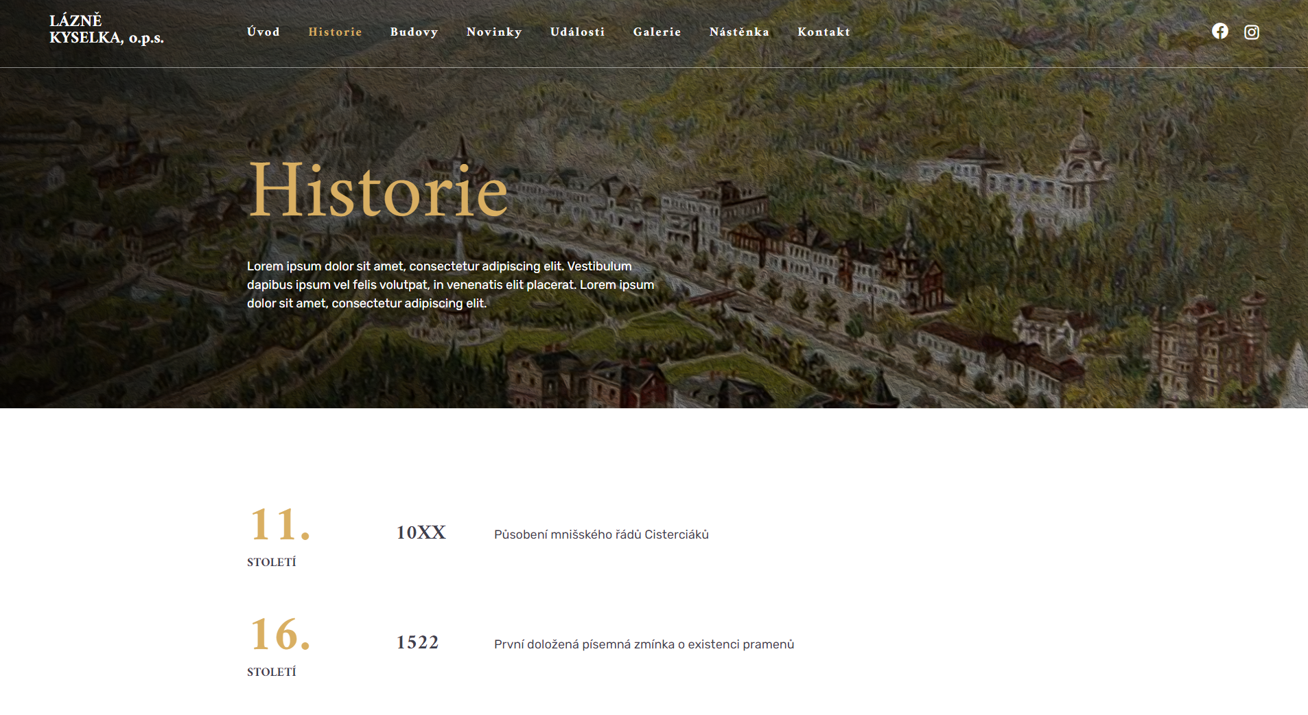
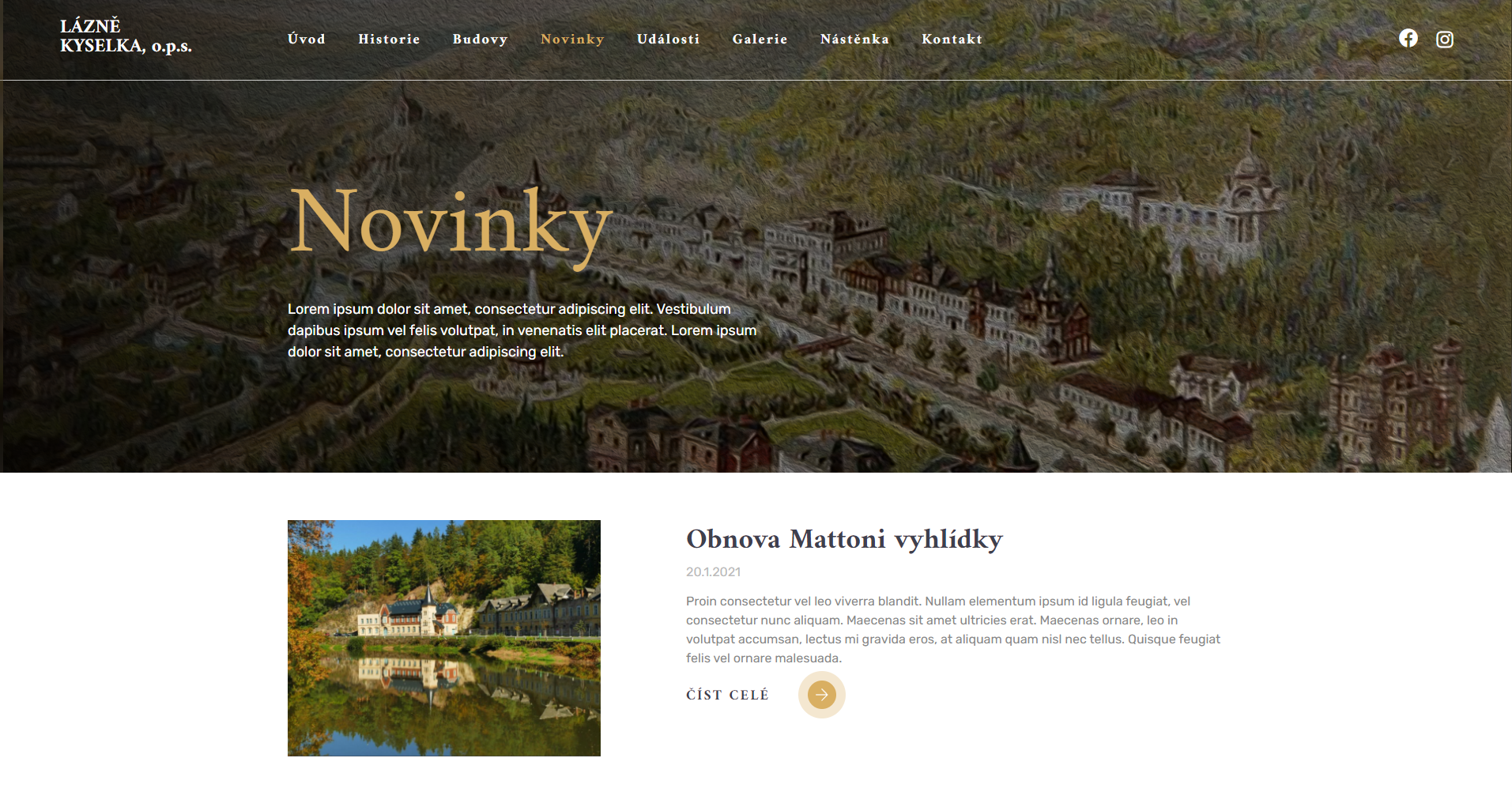
To achieve a blend between modern sublime design and an impression that highlights the grandeur of the site, we have always chosen a dominant featured image for the page header, followed by a light background to achieve contrast. We could afford not to be conservative, so we introduced modern, lightweight elements in many places to embellish the overall look. Globally, crisp elements and colours are applied in a combination of shades of grey and gold.
The text is intended to be as short as possible, leading on to individual details of, for example, buildings, where the visitor is only just becoming familiar with the details. Thus, the visitor is not overwhelmed by the content and can always skip to the exact section that is of most interest to them at the moment.
Result
The spa managers have been extremely satisfied since the first design proposal and are now able to present their pride well as well as communicate publicly all administrative happenings related to the company. For our part, we are very grateful to have been able to participate in the project in the public eye. We are happy to classify it as a project of some social impact.
We trust that the newly developed work will bring many satisfied responses in the years to come, and that the Trustees will be able to devote themselves to the administration of their famous grounds to the utmost.
They trust us


Now just drop us a line
There has been enough scrolling, now it is time to get in touch and make sure we are the right fit for your project!
Go to contact2018 - #year © TwoDo s.r.o., all rights reserved. The website is powered by our own TwoDo CMS.