Offer of state property

The State Property Offer offers unneeded property to the public through both sale and auction.
Web
Designing
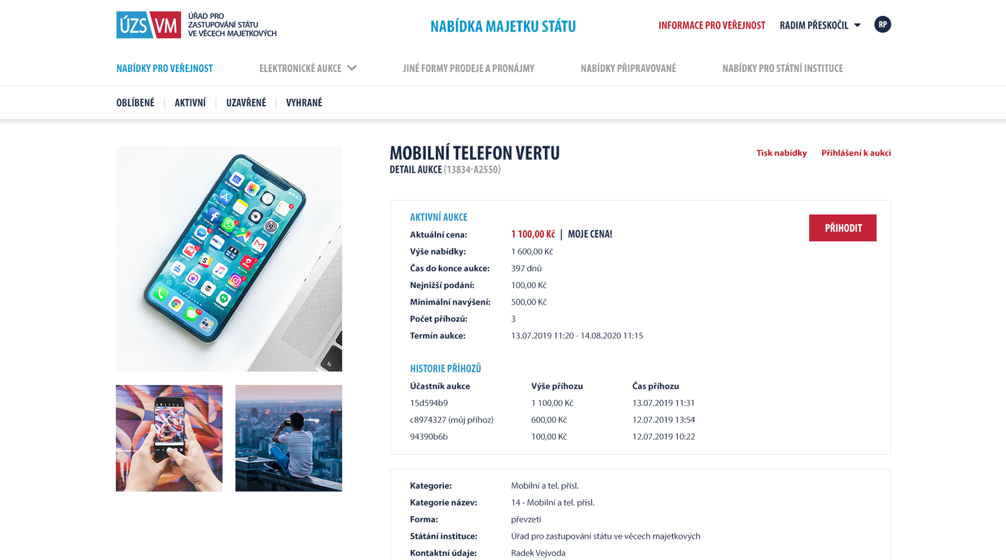
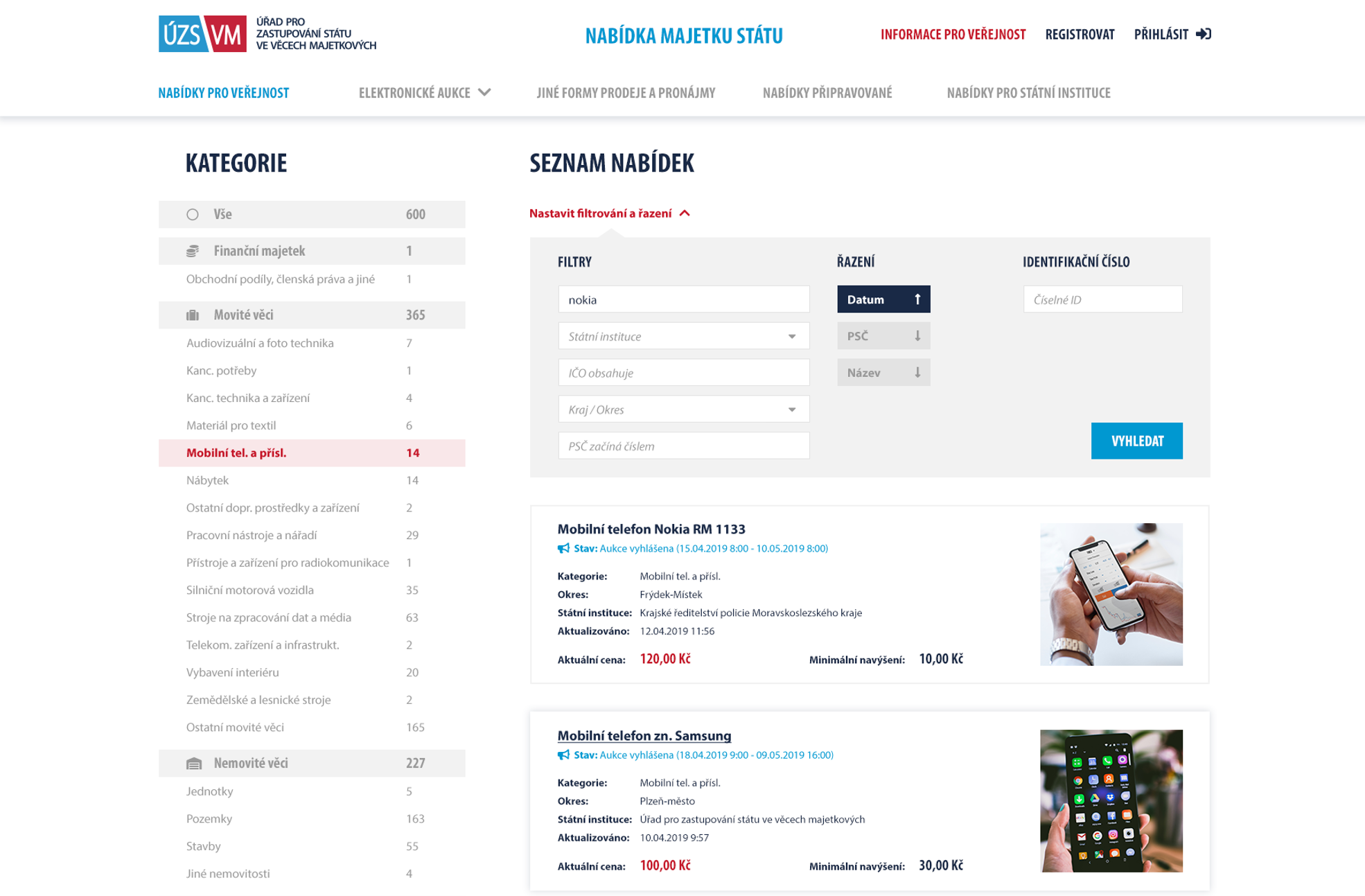
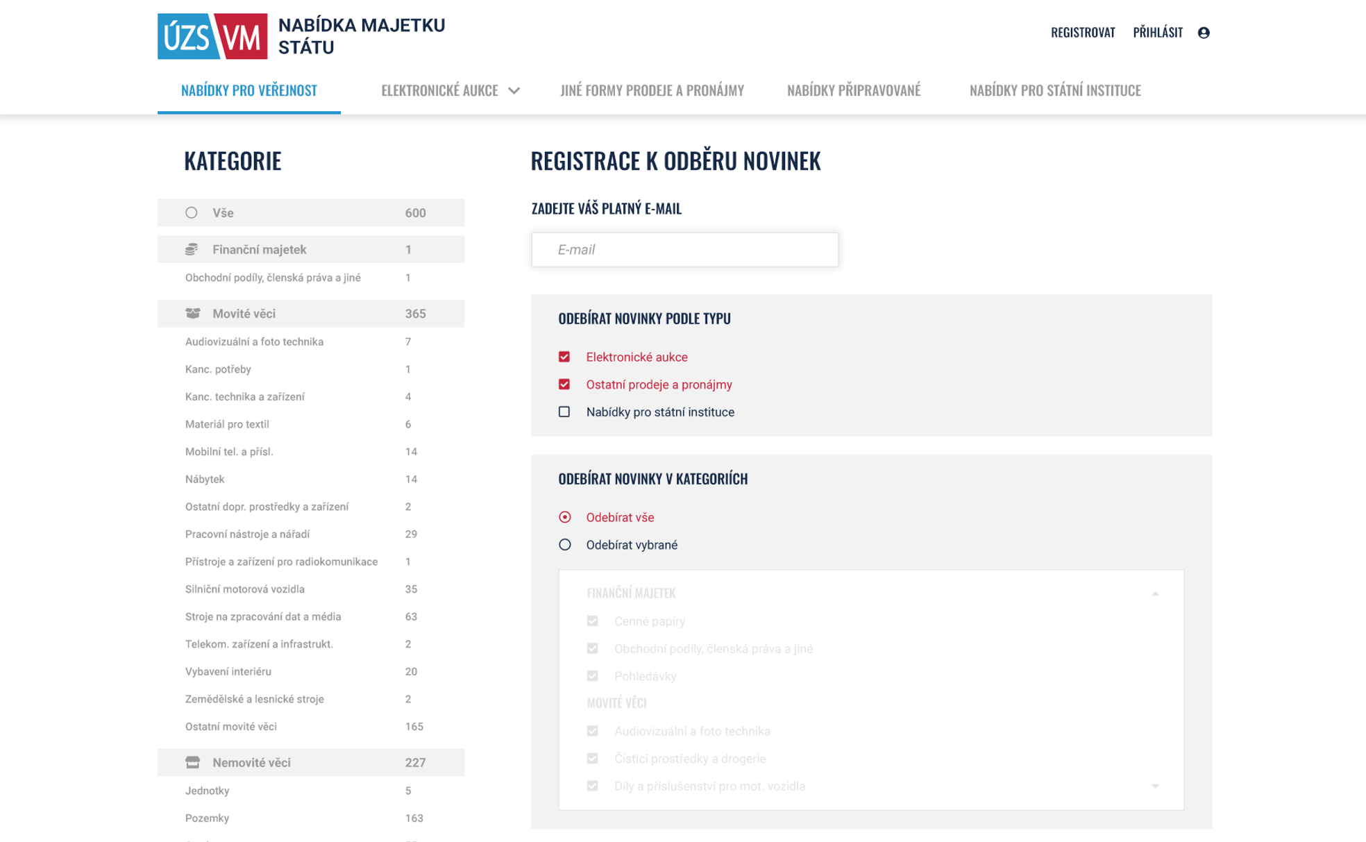
Our part of the project was to redesign the existing portal to make it user-friendly, intuitive, in a modern interface and introduce new functionalities to the interface.
Client accepted in 2019
a screenshot of a phone
stripe

Reason

The Office of State Property Management manages the State Property Offer portal. This portal was to be expanded with new functionality and with it a complete redesign to address historical ailments, responsiveness and maximise clarity of content for users and administrators. Due to our experience with portals on a similar scale, we were approached by the implementer to take on this role, which was both an honour and a challenge we were looking for.

The bid portal contains hundreds of thousands of movable and immovable items worth several billion crowns. So it is certainly not a modest content and the creation entailed a great deal of responsibility for both the site visitors and the administrators who browse the content every day.

a screenshot of a phone
stripe

Challenge

It should be mentioned that the entire portal is rich in different interfaces. It contains a menu of menu types, each type contains a detailed categorization and each list can be filtered. Of course, the portal allows you to register and log in. This gives the user access to a new menu level with its offers, and even two new menu levels with editing tools are made available to such an administrator. It is becoming apparent that the biggest challenge was thus to ensure clear operability on mobile devices, where there is not enough space, as on the desktop.

a screenshot of a computer
stripe

Result

First, we designed the desktop layout, where we fine-tuned the new brand with the client through the implementer, which included, among other things, the choice of colours, fonts, shapes and interactivity. There was plenty of space to show the full display of the possible interfaces and how they impact the content being displayed. We relied on proven interface layouts familiar from e-commerce sites to help the user get oriented quickly. The listing of menus is handled through clickable tabs, which have to show a lot of information on a relatively small area.

Gradually, a layout was designed for tablet and finally for mobile. Tablet hid the larger surrounding areas as categories and mobile required a completely new approach, with almost all of the interface hidden in drop-down menus.

a screenshot of a computer
stripe

Result

It wasn't easy, but through extensive user experience testing of the portal's behaviour across devices, we managed to settle on a design that met the exacting requirements. This managed to cover even the most challenging use cases, such as administering from a mobile device. This has resulted in a successful state portfolio website that boasts a modern look and feel and unique responsiveness.

The project has provided us with many valuable lessons learned through successful and intensive collaboration with the contractor implementing the proposed design. It is always a pleasure to see hard work turn into a functional result.

Contact us

Now just drop us a line

There has been enough scrolling, now it is time to get in touch and make sure we are the right fit for your project!