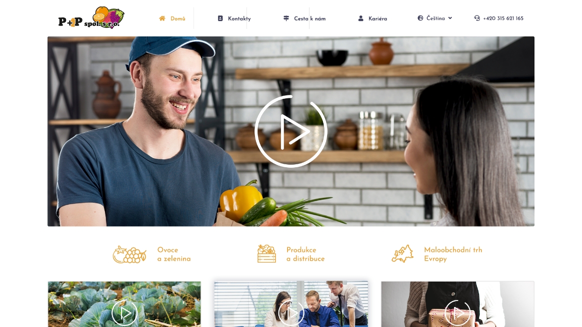
P+P
P+P is a regular supplier of quality fruit and vegetables from its own production to retail chains.
Web
Designing
Programming
Branding
WordPress
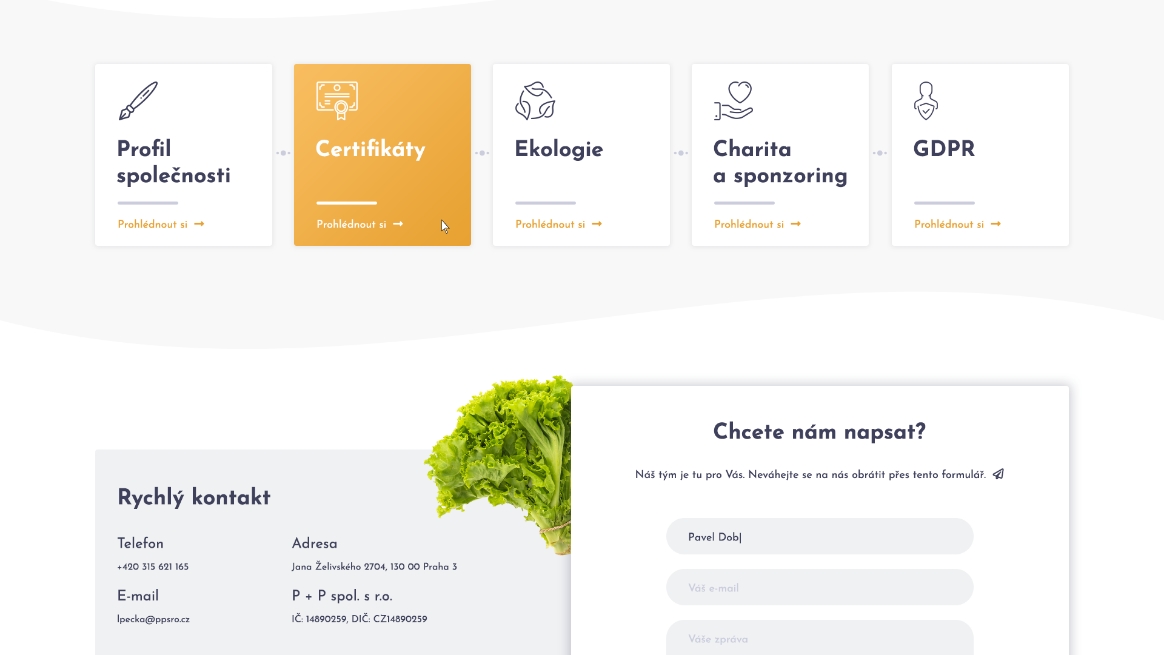
We created a new web presentation visually complemented with fruit and vegetable motifs, waveforms and videos that properly represent the company's activities.