Office for Technical Standardization

ÚNMZ is responsible for ensuring the creation, technical standards, standardization documents and publications.
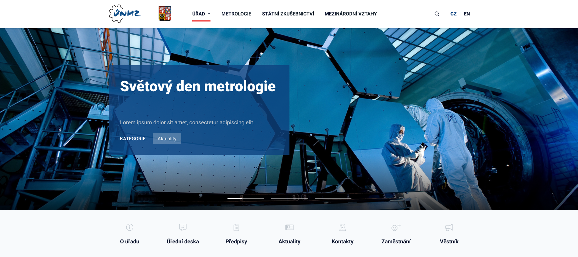
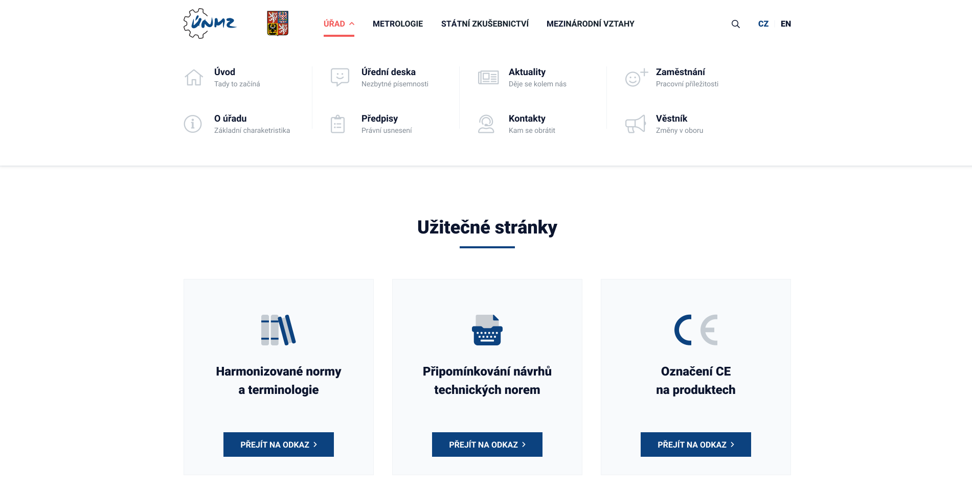
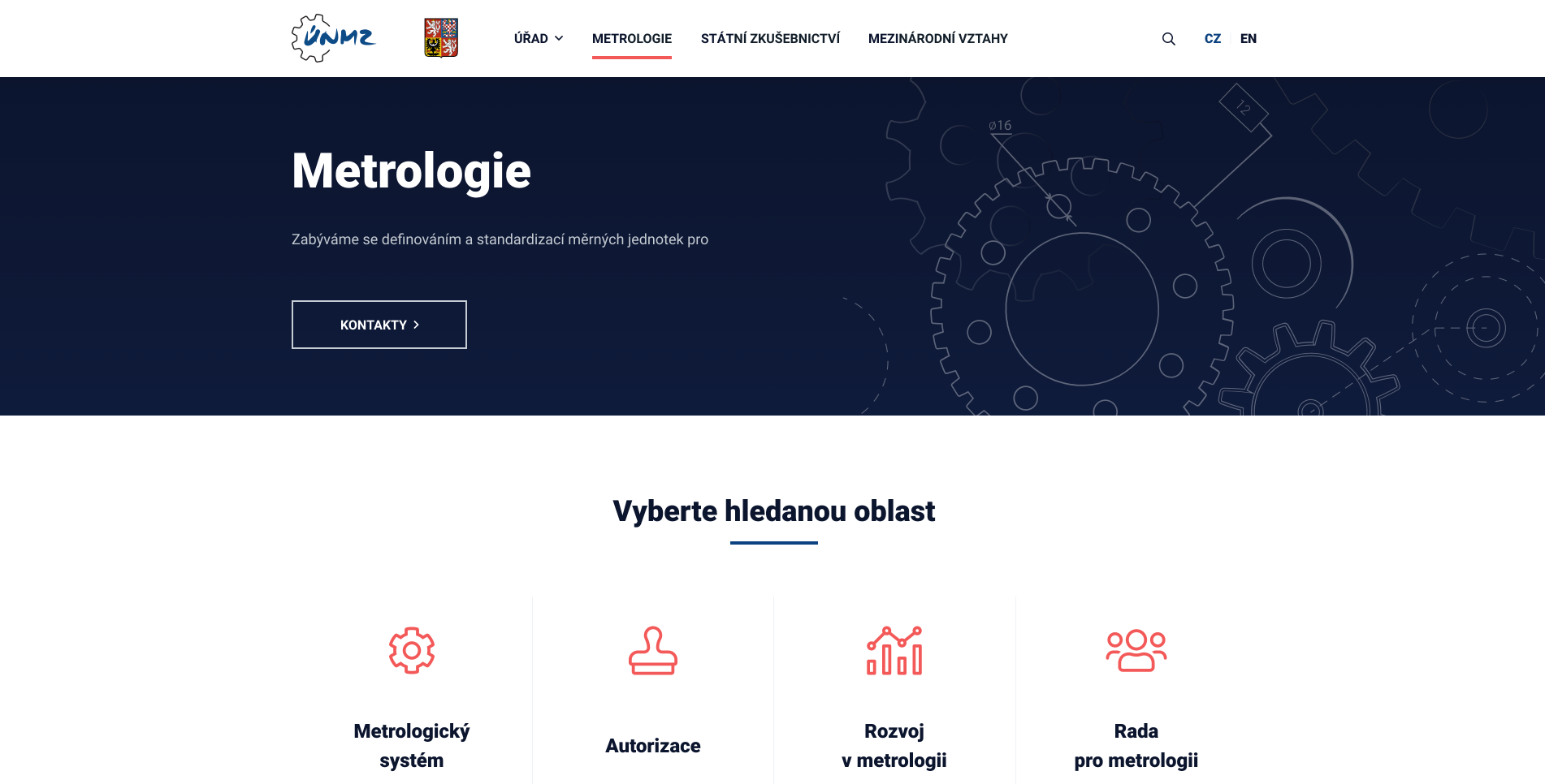
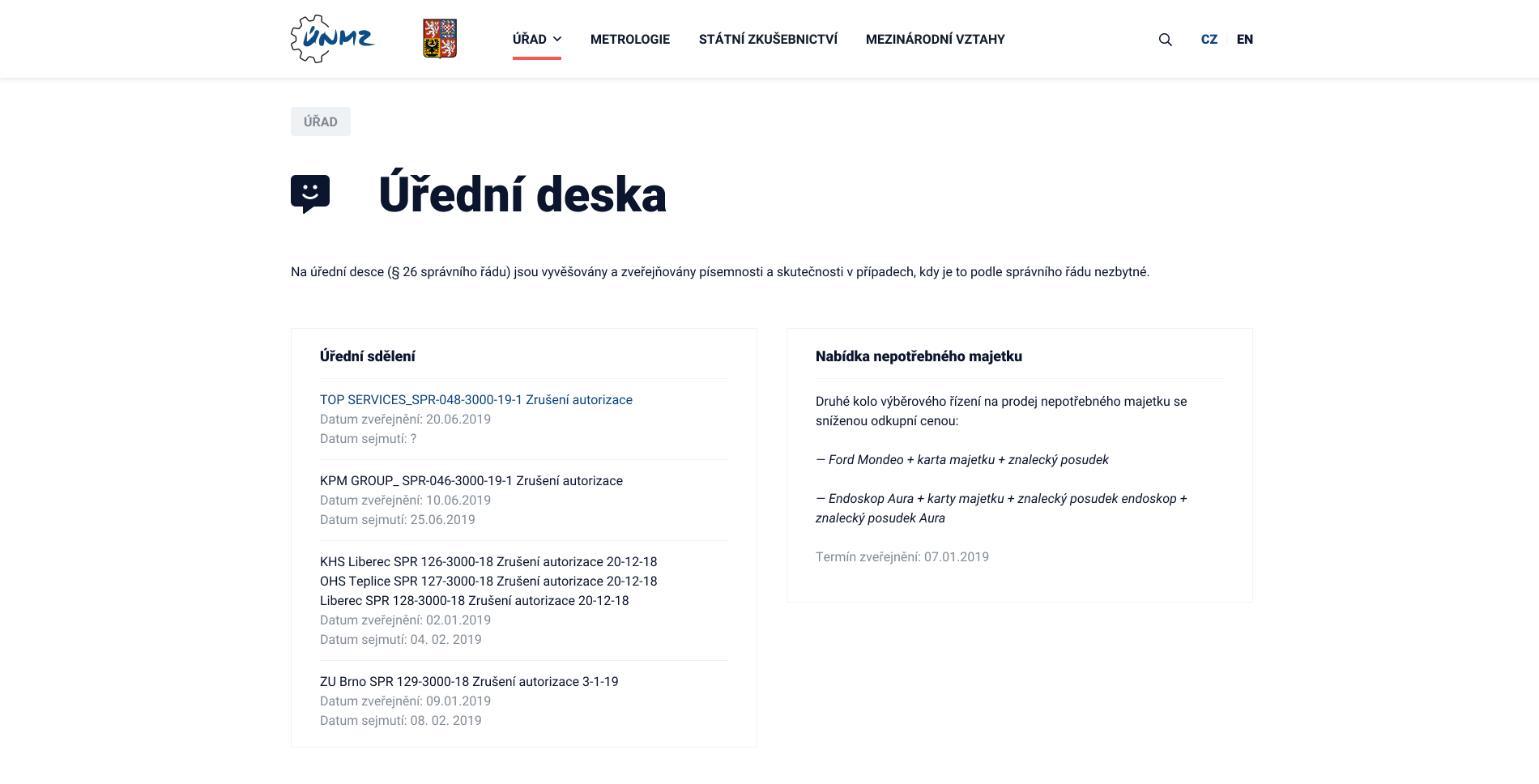
Web
Designing
We created a new design for the office that reflects their identity in the modern age. The result is a professional web prototype for both desktop and mobile devices.
Client accepted on February 7, 2020
a person in a white suit
stripe

Reason

For many years, the Office for Technical Standardization, Metrology and State Testing (ÚNMZ) operated a website on an outdated design that no longer met modern standards. It lacked optimization for mobile devices and a clear and graspable structure that the user could easily navigate.

There was an effort to redesign the website for a long time, even a new concept of the website was created, but it looked very ordinary, template-like and lacked the overall emphasis of dignity that such a technical institution should have. However, the work did not come in vain, as this concept became the content template for our solution.

a person in a white suit
stripe

Challenge

The client had a very comprehensive idea of what they wanted to achieve on the site. From the beginning, they talked about using a tile style as the basic design element of the categories. It was the categories that presented a challenge, as the whole structure of the site was heavily sub-page rich and clarity in this regard had to be achieved. Clearly defined core areas and how much content could be in them were required so that the design could cover all the extreme cases and maintain elegance.

Another desire was to make the design sufficiently interactive and coherent in its "technical" branding. This of course pleased us, we were able to play as creatively as possible with the transitions of elements in the jointly defined identity.

a screenshot of a web page
stripe

Solution

In order to respect the technical direction, we agreed with the client to keep the darker blue colour, complemented by greyish shades together with a complementary red colour. The website was not intended to look dark, so all elements were placed in a white background. The various categories were supplemented with technical drawings to further enhance the impression. The tried-and-true sans serif Roboto proved to be the ideal font for the site.

The site seeks to present four main categories, one of which is the presentation of the office itself. With the potential for greater immersion in sub-categories, everything is complemented by top "tag" navigation to improve orientation. The lowest level of categories is no longer tile-style, as there may be longer titles, so they have resorted to strips.

a screenshot of a web page
stripe

Result

The resulting web design successfully combined all the requirements, enriched it with a modern technical style and supported interactivity with transitional effects in the movement of icons, colour changes, etc., without anything starting to look confusing. The client received both desktop and mobile views of the design, which he could completely click through in an interactive online version created via Adobe XD.

From the beginning of the designs, we thought ahead to how the blocks would be arranged on other devices. This made the transition from desktop to mobile completely natural and intuitive. The client was almost immediately happy with our creative contribution to the solution and there was a complete minimum of backlash. This allowed us to complete the entire project really briskly with great appreciation and respect on both sides.

a screenshot of a computer
Contact us

Now just drop us a line

There has been enough scrolling, now it is time to get in touch and make sure we are the right fit for your project!